#3 Dialogue System
The dialogue system is on its way!
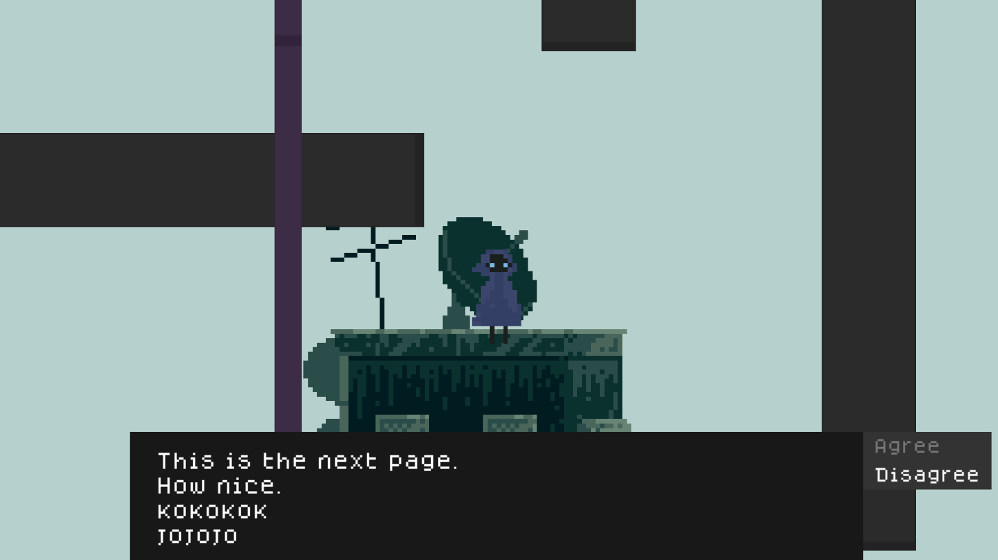
Thanks to Semag Games' dynamic dialogue system tutorial series, I am able to make, well, a dynamic dialogue system with responses. I have made a dialogue system before, but I wanted to try and make a new one for better branching stories and responses.

There was already dialogue system code in the last version of the game I released, however it was not working. Now I have fixed the problems and I am happy to show off the dialogue system using scriptable objects, which was also a first.
I've also been looking at fonts
I have tried looking into making my own font, however I do not have Illustrator, nor have I found a different font making tool. I don't have experience designing,making & using my own original font, & that may be a project for another day.
However, there are plenty of lovely fonts out there! I am currently interested in using:
▴ Dogica by Roberto Mocci
Both are free for commerical use, which makes things easier for me. And of course they are both pixel fonts with their own personalities.
Dogica is more readable & therefore more valuable for a game which involves a lot of text. The font also has certain letters with little quirks, making sentences look 'disfunctional' or imperfect. Which all fits the world of the game. In the image above, the Dogica Pixel font is being used.
Poco is a more pixelated & compact font. Less readable, but since the lettering feels 'smaller' it gives this vibe of cuteness, innocense & simplicity. That would be a subtle contrast to some of the dark themes of the game, but otherwise that cuteness appealing to the look of the characters.
Custom Textbox
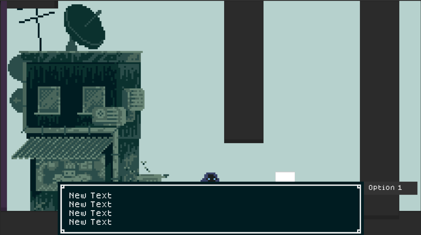
It took me unnecessarily long to find a tutorial on how to slice & used your own graphics for a textbox. Luckily MetalStorm Games had the perfect video for 9 slicing.

The current look of the textbox is just an idea I had. The look will definitely be updated in the future to better fit the aesthetic of the game.
For when dialogue is activated, I have a second cinemachine camera zoom closer to the characters. It is currently very flimsy, but conveys the idea of what I want it to be like. I used samyam's tutorial on this.
Colour Scheme
Below is the current base palette. I have been thinking how I can use these colours effectively to build my game's world.

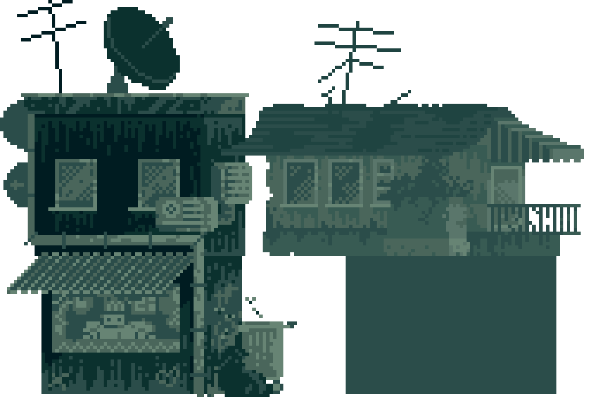
I tried drawing a building using these colours again, but this time refraining from using the very dark colours.

The building on the right was my second attempt trying to figure out how to distribute the colours. It is very muted in comparison to my first attempt on the left. The first building has so much more contrast. The second building is just too muted & it can be hard to recognise what is going on. Valuable lesson:
▴ The foreground buildings the player will interact with need plenty of contrast to stand out
▴ The objects the player can interact with need to stand out/need some sort of visual cue. I am thinking a light colour scheme to contrast well with the dark buildings.
▴ Buildings in the background should fade into a lighter colour to create depth/fog/distance.
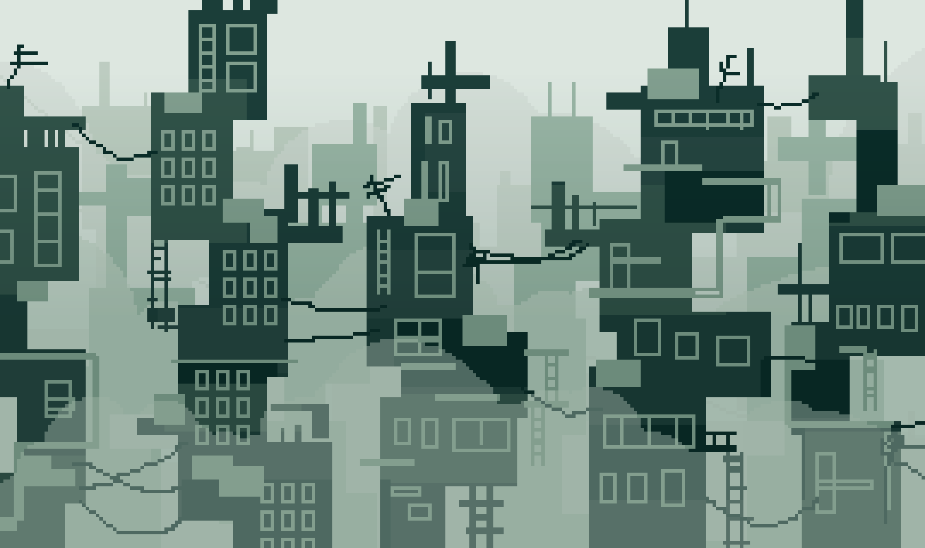
After watching one of AdamCYounis' "How I Design Environments For Storytelling" video, I felt inspired to try his process of making an environment. Instead of straight away blocking out the final look, create a thumbnail sketch instead.

This thumbnail sketch shows off my idea for the look of the game pretty well. I did notice a few things with this sketch:
▴ Foreground buildings should be dark but not share the same colour. At least 3 dark base shades for more variety.
▴ If the interactable objects have a very light colour scheme, their colours could fade into the background with the background buildings which also share a very light colour to them. I do want the interactable objects to be very light instead of a middle tone. 1. They have a better contrast & show the player that they are important. 2. The middle tones are reserved for decorative objects & elements in the environment. E.g. planters, posters, signs etc. They are unimportant to playing, but are important for creating a visually interesting environment.
I did try making some ladders hanging off the buildings use the same dark shade as the building itself, so it wouldn't blend into the background. But then it breaks the colour rule I have set for these objects. It may all just be down to finding the exact right shade between the interactable objects & the background.
Having all the interactable objects share 1 light shade is extremely boring, so I want to use 3 base shades that are light. So, not only is there more visual interest, but I could use the darkest shade of those colours for objects that hang off the building/come in contact with the background. I can stick to my "light colours for interactable objects" rule, but also let objects have enough contrast to the background to stand out.
▴ The fog between the layers of buildings really helps to show depth & give atmosphere. 1. It is a polluted city. 2. The fog can show off the scale of the buildings, almost acting like clouds.
▴ The contrast & difference in shade between the foreground buildings & the first background layer is relatively high. On one hand it is good to have a strong contrast, so the player can easily determine what is in front & what is not. But with such a big jump in values, I have limited amount of layers for the background. I think again, this will have to be fixed with the tweaking of colours & experimenting.
I am happy the most important objects & their colours are almost done! It will be tricky figuring the rest out...
What's next
▴ I'm looking into state machines. I have used state machines before, but using Bolt, so I have a lot to learn when it comes to making state machines in C#.
▴ Slight fixes to when the zoomed in camera for dialogue appears, though this may tie in with the state machines
Files
Get Sorrow Thief
Sorrow Thief
| Status | Prototype |
| Author | SunnyShadow |
| Genre | Platformer, Adventure |
| Tags | 2D, Singleplayer, Unity |
More posts
- #2 New AdditionsAug 17, 2021
- #1 PrototypingAug 02, 2021
Leave a comment
Log in with itch.io to leave a comment.